Want to learn all of Lee's illustration secrets? Check out his classes at SVSLearn, an online resource for artists.
Society of Visual Storytelling
The Society of Visual Storytelling, SVSLearn for short, is an online resource for aspiring illustrators. It came together in 2012 as a way to offer online illustration classes created by professional illustrators. Will Terry and Jake Parker started making instructional videos that showed their actual working process for working as an illustrator. Lee White joined the team in 2014 and together they are building a resource to help anyone who is interested in art and illustration. You can find out more by clicking the link below.
Lee’s ONLINE ART CLASSES

CHILDREN’S BOOK PRO
If you dream of becoming a children’s book illustrator, this class is for you!
Pro illustrators Lee White, Will Terry and Jake Parker together have illustrated more than 70 children's books and will show you step-by-step EXACTLY how to go about it. You will see each of their specific working techniques and find the one that matches how YOU want to work.

Lee is one of the hosts of 3 Point Perspective, the podcast about illustration. Check it out!
3 Point PerspectivE
If you are a fan of illustration and podcasts, be sure to check out 3 Point Perspective, the podcast about illustration!
Tune in as Lee White, Jake Parker and Will Terry talk shop about illustration - how to do it, how to make a living at it, and how to make an impact in the world with it. You can find it on iTunes, Google Play Music, Spotify, YouTube and the SVSLearn website.
Lee’s favorite episodes

PATREON
Want to see what it’s like behind the scenes?
This is where I share a more personal look at my work. I’ll also share strategies to help you figure out how to make your work better too! Become a patron to get access to all this and more!

Lights! Camera! Action!
YouTube
Check out my YouTube channel! This is where I post free videos on how to improve as an artist. You can also find demos of my painting process there. Subscribe to get the latest!

I'm often asked about what kind of supplies I use. The art store can be so confusing and ordering online is even worse. There are so many options to choose from. The stuff you see below is all tested by doing a LOT of paintings and I know it works. I've listed a little info about each product which can hopefully help you out when you are trying to figure out what to buy. : )
TOOLS
People always ask what supplies I use, so I put together a little list of some of my favorites.
Please note: By using the links below, you'll be directed to Amazon where you can buy these awesome tools for yourself. As an Amazon Associate, I get a small commission, at no additional cost to you. Thanks for your support!
Paper
I love Arches Paper and have used it for years. I prefer the bight white variety because it makes color pop really well. It's a great all around paper and will work for most techniques. It handles mixed media really well. The link here is for the 190 lb. paper which will need to be stretched if you are really using a lot of water or heavy washes. I highly recommend this paper if you are starting out in watercolor
Paint
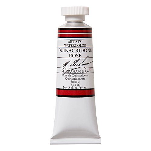
My palette is fairly small compared to other painters. Many times I will only use 3 or 4 colors max in a painting. This is the basic set that I highly recommend. You can make almost any color with them. I prefer M. Graham paints. They are affordable and very high quality. You don't find that combination too often with art supplies. They are easy to re-wet so you don't have to keep putting out new paint every time.
Here's a litttle about these colors:
Quinacridone Nickel: Beautiful warm transparent yellow that is a wonderful mixing color or used by itself. Great for glazing too.
Yellow Ochre: Opaque muted earth tone that is a workhorse of a paint for me. I use it a lot!
Burnt Sienna: This is a great color for mixing as it neutralizes many mixtures so your paintings don't get too saturated. I use burnt sienna combined with Ultramarine blue for most of my grey tones.
Permanent Alizarin Crimson: Cool red that mixes beautifully. Great for glazing and almost any application. Combined with Nickel Quinacridone will make a very saturated red similar to cadmium red. Regular Alizarin Crimson will fade so it's important to get the permanent version.
Ultramarine Blue: Warm blue that mixes well and leaves beautiful textures to washes
Cobalt Blue: Weak blue that is wonderful for subtle skies. Great glazing color too!
Indigo Blue: Very dark blue that I use to get really dark darks. Great for stormy skies
Permanent Rose: Weak transparent red that is great for glazing and subtle tones.
Brushes
I only use a few brushes and these are the ones that I think are essential
More products coming soon...


